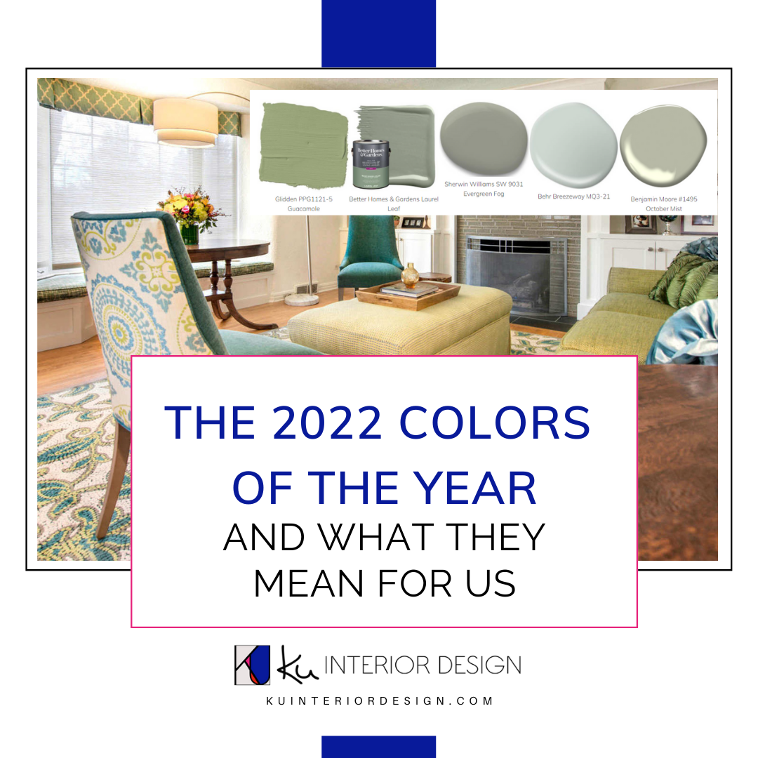
Those who work in the design space know that the color of the year represents much more than just a simple trend. Colors of the year have a lot to say about the state of our economy and our society as a whole, something many people don’t realize.
What Does the Color of the Year Represent for Society?
Every year, several color institutions (such as Pantone, Benjamin Moore, and Sherwin Williams) nominate a color to serve as their “color of the year.” Colors of the year are chosen at the end of the year to represent a reflection of what is happening in culture for each given year. The nominated colors of the year can represent the state of our economy and our culture.
For example, softer colors such as soft blues and pale pinks might be chosen when our society needs tranquility and security. Brighter and happier colors may be chosen as an antidote to hardship when our economy is in a state of depression or recession. Pantone recently chose illuminating yellow and ultimate grey for their 2021 colors of the year, stating that,
“The union of an enduring Ultimate Gray with the vibrant yellow Illuminating expresses a message of positivity supported by fortitude.”
Many consumers are unaware of the fact that big manufacturers use the colors of the year as inspiration for their upcoming collections. This allows big brands to base product designs on a common theme, simplifying the items that they will consider to be “trendy” for a given year.
The 2022 Colors of the Year
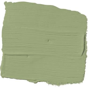
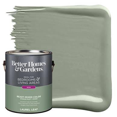
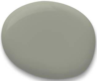
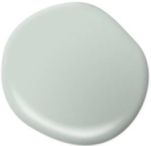
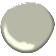
A common trend that we’re seeing amongst the colors of the year for 2022 is that many of them are a shade of green. Greens promote a feeling of tranquility, peace, healing, and optimism. It is likely unsurprising to most that these are the feelings that we are collectively yearning for as a society, as we slowly continue to navigate a post-pandemic world. As a dominant color in nature, green can encourage feelings of growth, peace, and restoration and is even considered to be one of the most neutral colors on the color spectrum.
It is safe to say that 2021 was another interesting year for most of us. Many adults were laid off from their jobs or chose to walk away from their professions for personal reasons. This causes many of us to look forward to 2022 with the hope of a fresh start. The pandemic may not be entirely over yet, but we’re no longer in the circa 2020 days of lockdown and we’re moving forward feeling a renewed sense of strength, gratitude, and hope.
How to Incorporate 2022’s Color of the Year Into Your Next Design Project
I frequently see different shades of green chosen by my clients to be incorporated into their interior design projects. This is understandable because the right shade of green on walls or cabinets can create an incredibly soothing atmosphere and its neutrality makes it very easy to work with.
You could incorporate a deep green accent wall into your living space for a modern, sustainable look.
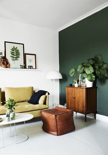
Image Source: Pinterest
Or consider a softer green for your kitchen cabinets, like this classic and chic design.
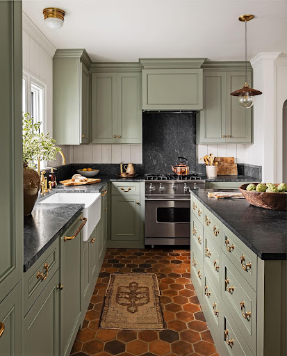
Image source: Country Living
Many people associate the color green with sustainable living. Get your green accents from some house plants paired with sustainable, natural materials such as rattan or wicker.
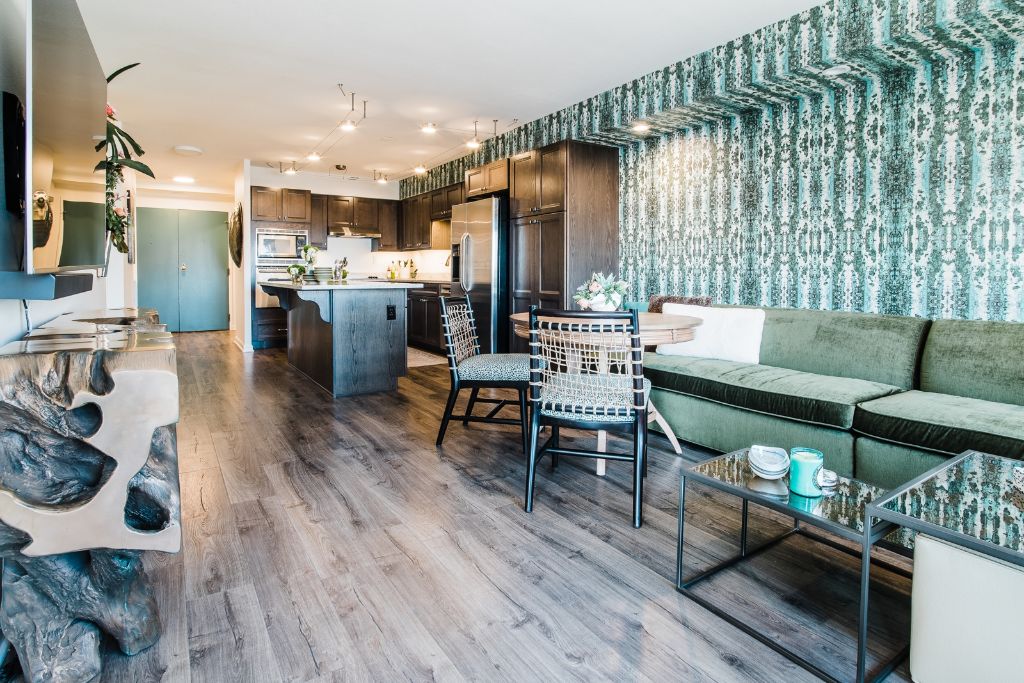
Photography By: From The Hip Photo
How to Pick the Perfect Paint Color for Your Home
Although I never encourage my clients to follow trends because I believe their design projects should be entirely their own, looking to colors of the year for inspiration can be a helpful way to narrow down the process of picking paint colors. If you’ve ever taken on the task of picking out a paint color, then you can likely relate to just how overwhelming it can be. With seemingly endless options, paint picking can make even the most experienced designer’s head spin.
I always save picking the paint color as the absolute last decision in our design process. It is much easier to pick a paint color that works with all of the other aspects of a room or home, rather than trying to pick the paint first and work everything else around that color. I never recommend testing your paint samples directly on your walls because your existing wall color will distort its appearance. Get a poster board and paint your samples on that, hold that against the wall to get a feel for how the color will look. This will also allow you to move your sample around the room to get an idea of how the different light exposure will affect it.
Many homeowners find picking paint colors to be one of the most overwhelming decisions for their design projects, so why not let me help?
I can help you select paint colors during our initial 1.5-hour consultation, or we can make it the final step in a lengthy design journey together — my services are malleable to any client’s needs. Book here

