It’s the end of the year, which means it’s time to look at what’s ahead. In the design industry, that means it’s the time of year when Pantone announces its Color of the Year. For 2020, Pantone has featured Classic Blue which, they say, instills “calm, confidence, and connection.”
The Psychology of Blue
What does incorporating blue into your home mean? DesignLike.com says this about the psychology of blue:
With the blue color you can create a cool and clear look. In the interior design, you can use blue to create an atmosphere of work and meditation. The color blue has been shown to lower blood pressure and heart rate. It is used to design the interior space to enlarge the room by a very light shade of blue. You can use blue to cool a room with much sun and heat. If used in kitchen, paint, furniture or dishes, blue color is said to decrease appetite and you can lose weight.
How can you incorporate this into your design?
Here are some examples from Ku Interior Design that incorporate blue:
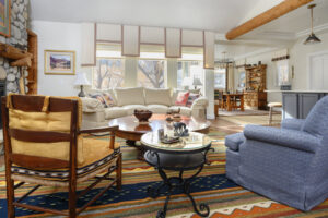
Pops of blue from the rug and upholstered arm chair.
Because all of the other colors in this home were either neutral or warm, we decided to pick up on the blue in the living room rug to add a cool color that would pop in the room, while still in keeping with the more traditional design.
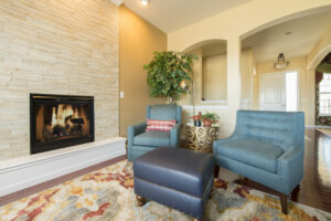
Pops of blue from the rug and custom ottoman.
In order to add a little color variety in the seating area by the fireplace, we selected a coordinating color from the area rug and window treatment fabric. This made the space feel custom and comfortable – perfect for the owner’s lifestyle.
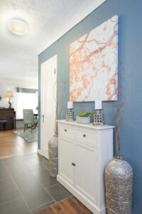
Wall color in the foyer.
This home had a wonderful open floorplan which meant that the rooms needed to coordinate seamlessly. While we kept many of the walls neutral, a darker color added drama to the entryway and worked with the design elements you could see in the other rooms.
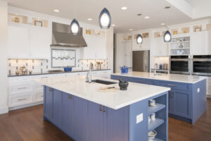
Kitchen islands.
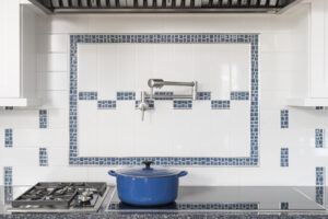
Who wouldn’t want a kitchen with this much work space? In this case, the client knew they wanted blue islands. This coordinated perfectly with the backsplash and added an extra custom design element.
Backsplash accent tile.
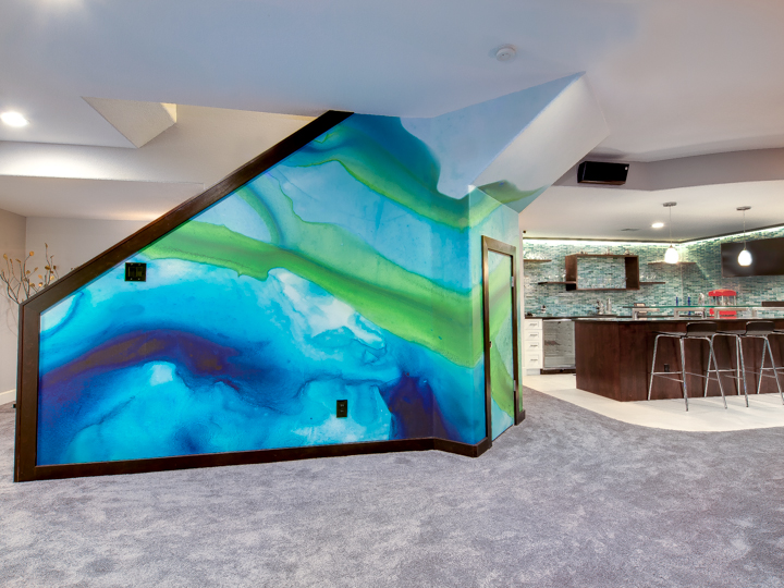
Blue in custom wallpaper.
After picking the tile for the bar and looking at other custom wall coverings from Black Crow Studios, we chose a design that we liked and then requested Black Crow Studios create a similar design using the colors in the tile. It’s important to work with someone who knows all the options for custom work; while this homeowner could have painted this wall a basic blue, the wall covering made this space truly one of a kind.

How can I help?
If this blog has inspired you to make changes, I’d love to help you with your project. From entire remodels to just changing up what you have and incorporating what you already own, together we’ll make your space feel entirely YOU.
For more about how the Pantone Color of the Year began, check out this article from Architectural Digest!

