
Monochromatic color schemes often get a bad rap for being dull, one-dimensional, or the easy way out by only having to choose one color. However, when executed with intention, a monochromatic space can create an effortlessly sophisticated and cohesive aesthetic. It’s more than just simply using one color—it’s about exploring the depth, variation, and texture within a single hue to craft a space that feels both elegant and inviting.
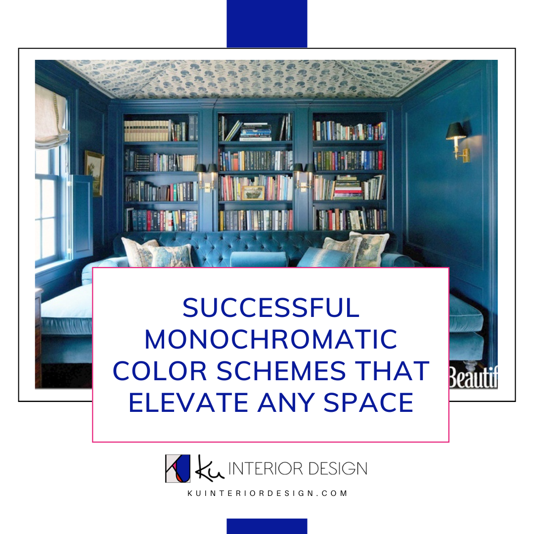
 2405 | Photo by: From The Hip Photo @fromthehipphoto
Why Monochromatic Works
With a monochromatic color scheme comes an inherent sense of balance within a space. Working with a single color family allows a space to naturally feel more harmonious. With one dominant hue guiding the design, I can shift my focus to texture, pattern, and shape to bring life to a room and create visual balance. Selecting furniture, finishes, and decor becomes a more seamless process. Plus, a monochromatic design has great longevity—sticking to a cohesive color story prevents your space from feeling trendy or like a fad. This design approach is ideal for those who long for a serene yet sophisticated environment, without the distraction of competing colors that can lead you to feeling overwhelmed.

Photo by: House Beautiful
Key Elements to Consider
Color Selection
Choosing the right color base is essential, after all, a monochromatic look revolves around color. Consider the mood you want to set. Cool tones like blues and greens evoke feelings of calm, warm neutrals like taupes and beiges create an inviting atmosphere, and reds and yellows can incite energy within a space. When selecting color, it’s also important to not only make a decision based on what colors you are drawn to but also what the function of the room is. For instance, if you have an open and airy living room with lots of windows, selecting light and delicate shades can further enhance the space to feel even more open and spacious.
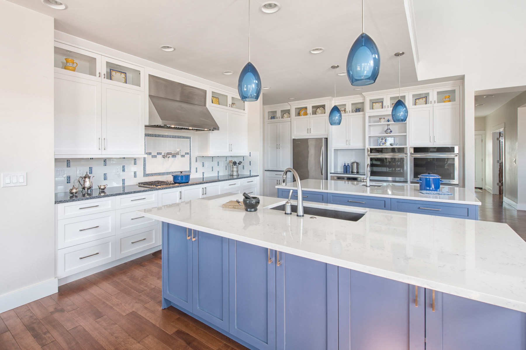 Parker Kitchen | Photo By: Brad Nicol Photography
Layering Tones and Textures
A monochromatic space thrives on variation. When designing, all the energy that would’ve been spent on balancing colors can in turn be used to balance tones and textures. Finding creativity in these areas is how I bring monochromatic looks to life. To keep the design from feeling flat, incorporating a range of tones helps to bring depth to the space. Think of a soft gray paired with charcoal accents or a navy blue touched with complements of sky blue. Texture is equally important and also fun to play around with, a few of my favorites are: velvet, linen, stone, and wood.
Lighting
The right lighting can make or break a monochromatic design. It’s important to consider the bulb’s color temperature, making sure you have the perfect warmth or coolness for your monochromatic color scheme. I like to layer overhead, task, and accent lighting to highlight tonal variations. Natural light also plays a major role in how the space feels and how the color is brought to life. It is important to consider how the chosen color reacts throughout an entire day’s light.

Photo by: Wipro Lighting
Practical Tips
If you’re new to monochromatic design, it can feel daunting, but I have a few tips on how to make the experience an enjoyable one. Begin with a neutral base, such as whites, grays, and beiges. Neutral bases offer flexibility, allowing you to build depth with richer accents in the same family. From there, you can further add interest with upholstery, rugs, and wall treatments as opportunities to introduce contrast.

Project: Humboldt St. Kitchen | Photo by: From The Hip Photo @fromthehipphoto
Avoid Common Pitfalls
An easy trap to fall into with monochromatic design is selecting a single color and tone and relying too heavily on it. Just because the design is based on one color, doesn’t mean you cannot introduce different tones and shades into the space. On the other hand, straying into incorporating too many variations in tone and shade can result in a space that feels visually cluttered and less harmonious.
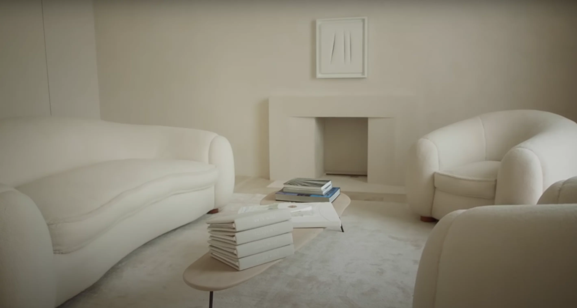 A toneless monochromatic look | Photo By: Vogue
As previously mentioned, lighting plays a crucial role in bringing together a monochromatic space. Poorly lit spaces can make even the most well-designed rooms feel lackluster. Observe how natural and artificial light interacts with your color scheme. Place your colors under warm, cool, natural morning, and natural evening light, and watch how they interact to see if the color needs to be altered or if more or less lighting is needed.
Let’s Find Your Hue
Monochromatic color schemes result in a timeless and elegant design when done intentionally and with attention to detail. They are anything but boring.
 Garfield St | Photo by: Brad Nicol Photography
Are you ready to live in a polished and cohesive environment? Let me create a sophisticated, monochromatic space for you to love. Book a FREE discovery call today.